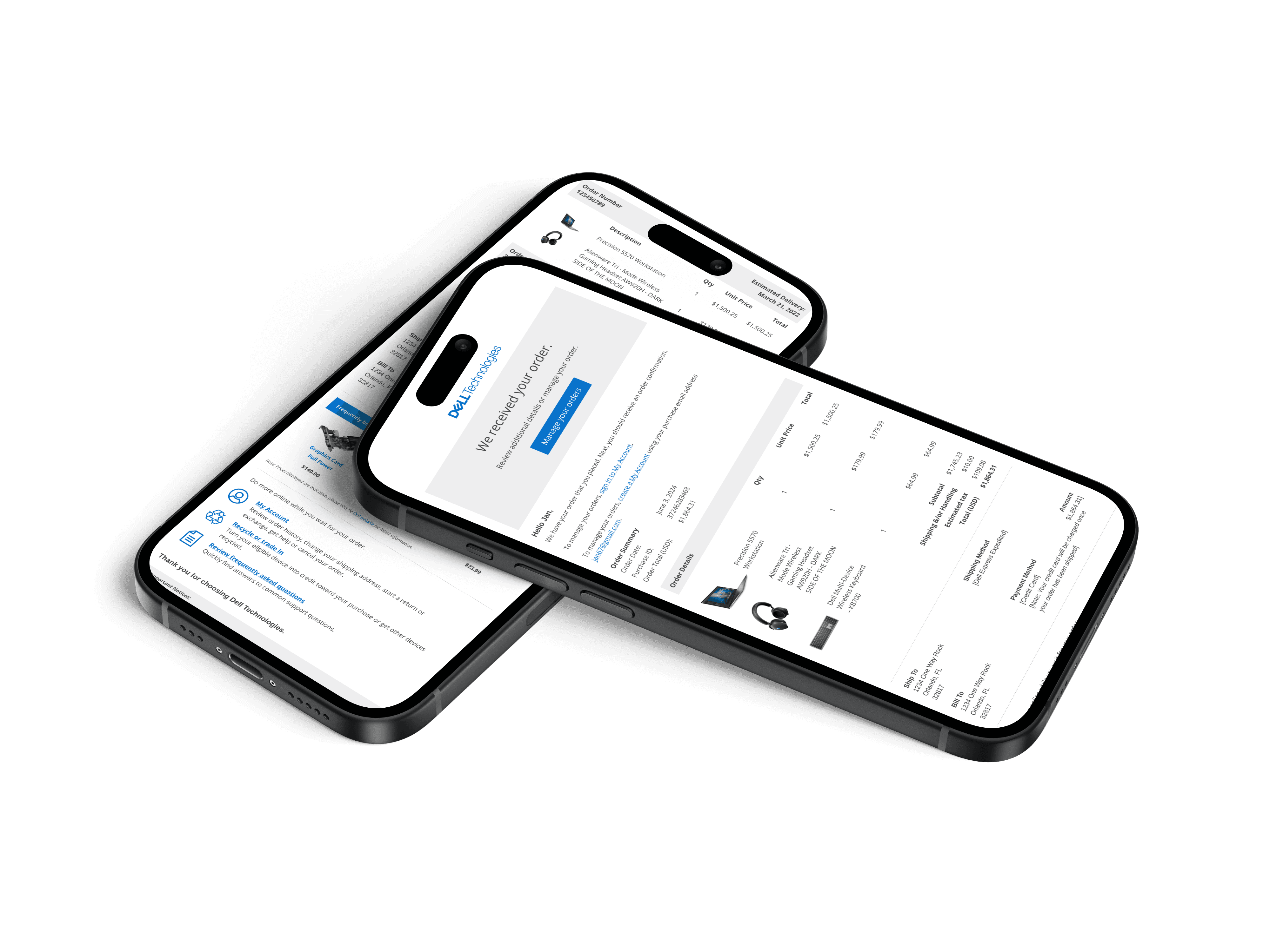
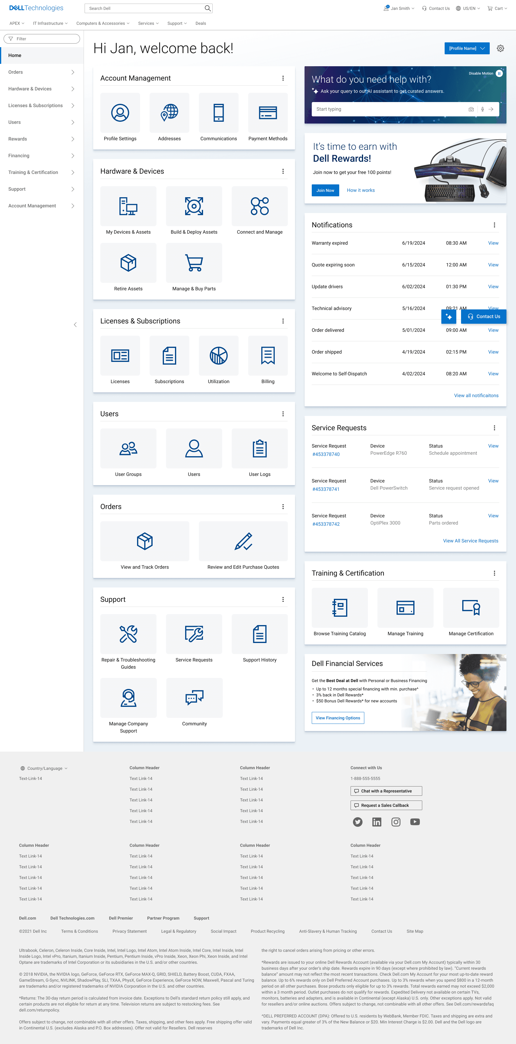
Project Overview
My team was tasked with creating early concept designs. We noticed inconsistencies in our work that confused stakeholders and suggested we weren’t collaborating effectively. In reality, the designers on our team were frequently collaborating, but the differences in the look and feel of our designs indicated otherwise.
This issue arose from a lack of standard frameworks for early-stage concept designs. While Dell's Design System was designed for high-fidelity mockups, it didn’t address early-stage needs. This presented an opportunity for us. With my co-designers Eric and Simha, we developed a solution specifically for this crucial phase.
Thus, we asked
How might we improve early concept creation for designers at Dell Technologies?
SPOILERS! OUR SOLUTION:
UI Kits
We created both a Low-Fidelity and Mid-Fidelity UI Kit.

Low-Fidelity UI Kit
A tool for swift ideation and iteration, freeing users from concerns about details such as color, typography, and placement.

Mid-Fidelity UI Kit
To be utilized post low-fidelity stage, enabling designers to refine their concepts further without committing to final design details.
1 | UNDERSTANDING OUR USERS
HOW DID WE APPROACH THIS?
Our Vision
To bridge this gap, my team had a vision in mind. They wanted to


DISCOVERY
Design Research
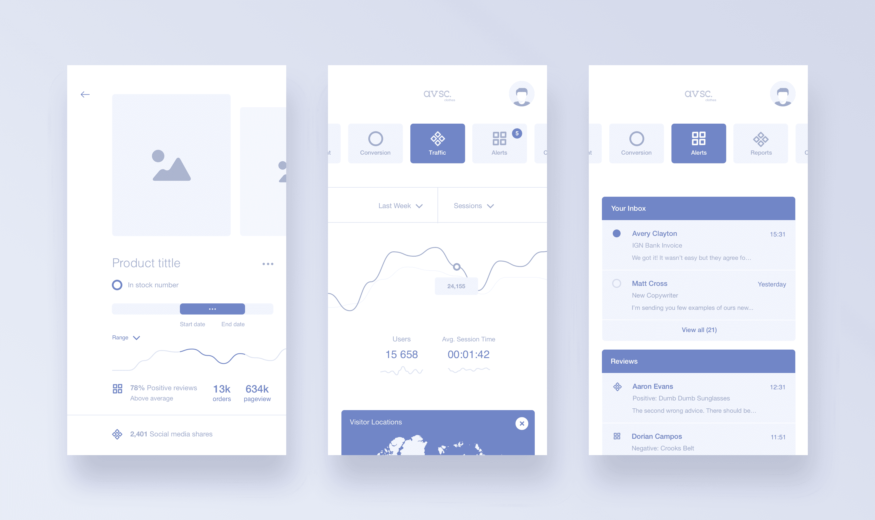
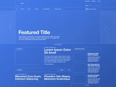
To kickstart this project, we began by exploring various UI kits across the web to gather ideas on what ours could look like. I drew inspiration from platforms such as Dribbble, Behance, Material Design, and the Figma community.
DIVING DEEPER
Customer Journey Map
Next, I wanted to better understand the users of these UI kits:
Designers at Dell
I created a customer journey map to
Understand how designers use UI kits
Identify any pain points during the process of using UI kits
Discover opportunities to add delight
By understanding their workflows and challenges, I could ensure the UI kits catered to their needs.

KEY TAKEAWAYS
UI kits need clear and comprehensive documentation with instructions on how to use the UI kit effectively.
Adding the UI kits should be friction-less and easy.
Low-fidelity designs should not be too abstract nor too detailed. You do not want to confuse stakeholders.
The UI kits should decrease the amount of time spent creating wireframes.
I shared my findings with the team, and we aligned on our objectives.
THE GOAL
Create UI kits that:
Enable rapid concept development
Are universal and accessible to all teams at Dell
Seamlessly integrate with Dell’s existing high-fidelity UI kit
2 | IDEATING
HOW DID WE GET STARTED?
Choosing Visual Styles


HOW DID WE GET STARTED?
Organizing our UI Kits
We decided to follow the atomic methodology to make our UI kits modular, consistent, and scalable.
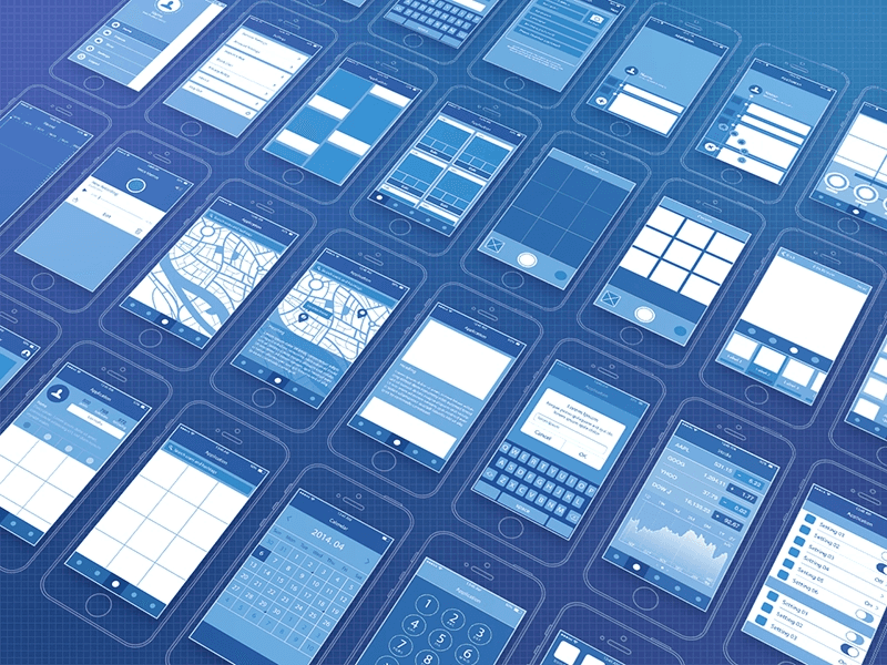
EXPLORATIONS
Brainstorming Ideas

Collage of images: some of the components we designed

Throughout this process we engaged in multiple rounds of iteration during both the creation and post-publication phases of our UI kits. Our objective was to continuously refine our UI kits based on insights and feedback from our users.
3 | FINAL DESIGN
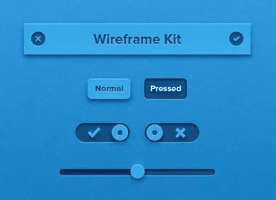
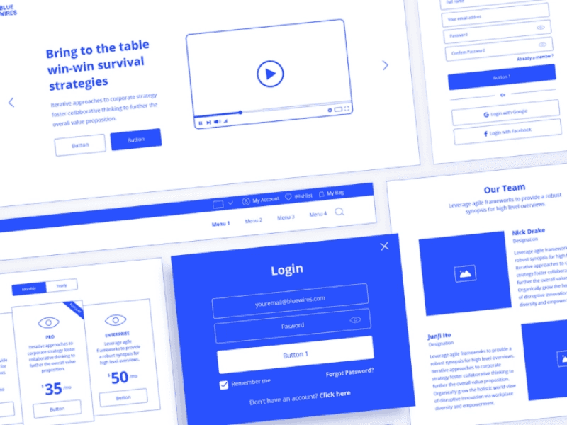
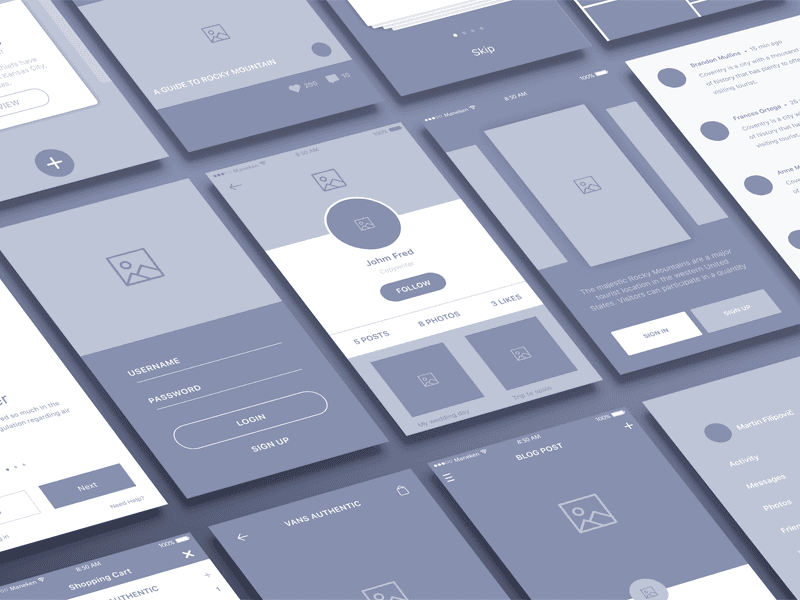
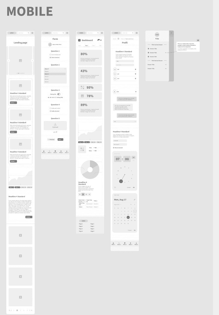
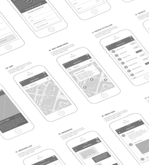
Our Low-Fidelity UI Kit has a simplistic, sketch-like appearance and serves as a tool for swift ideation and iteration, freeing users from concerns about details such as color, typography, and placement.
Our goal was to mirror the aesthetic of Dell’s Design System while ensuring it remained distinct from the final design. This kit is intended to be utilized post low-fidelity stage, enabling designers to refine their concepts further without committing to final design details.
A FEATURE WE WANTED TO ADD…
"Getting Started" Page
We included a “Getting Started” page to ensure a seamless experience with our UI kits. From my customer journey map, I learned the importance of making the process of using and adding an UI kit as easy as possible for new users.


A FEATURE WE WANTED TO ADD…
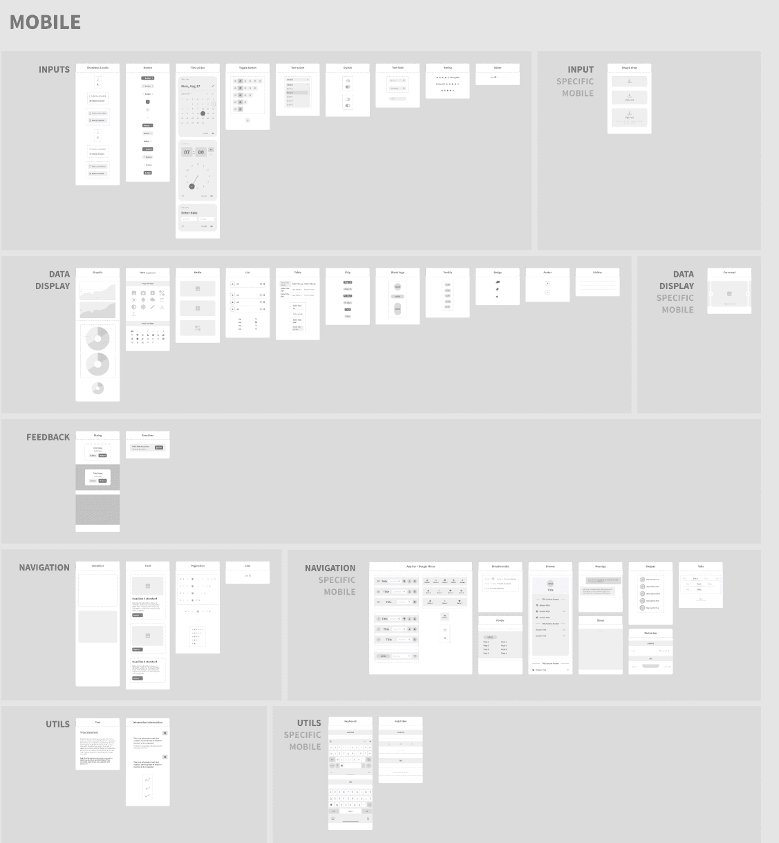
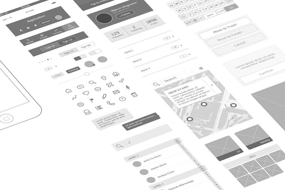
The Low-Fidelity UI Kit includes 57 components while the Mid-Fidelity Kit offers 47. Many of these include multiple variants, saving designers time and effort by reducing the need for them to break down and customize components. Additionally, select components incorporate micro-interactions, enhancing prototyping and realism.

A FEATURE WE WANTED TO ADD…
Alignment with Dell’s Design System
Both UI kits were created following Dell’s Design System, ensuring a seamless transition to high-fidelity.

4 | THE OUTCOME

We presented the kits to Dell's entire design organization, resulting in their full integration as the framework for low-fidelity and mid-fidelity wireframing. The feedback from other teams has been overwhelmingly positive.
Woven Into Our Design Approach
The UI kits have also been integrated into my team's design process when we're creating concept designs. We use the Low-Fi UI kit when we're ideating and want to show quick sketches to other designers. We use the Mid-Fi UI kit once we have the general concepts defined and want to create more detailed wireframes for our stakeholders.

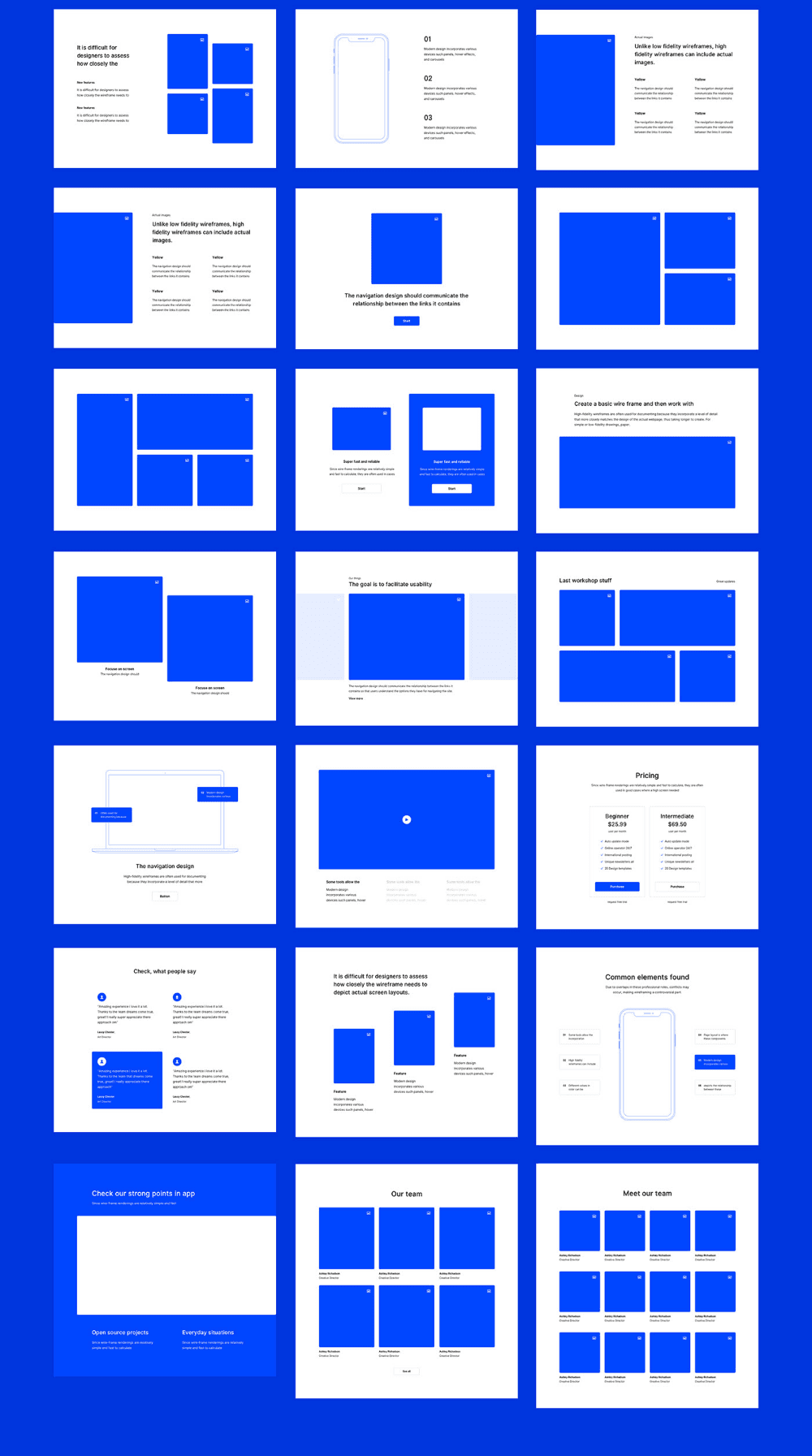
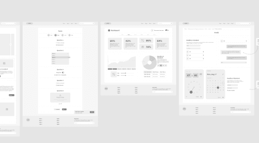
Collage of images: Some low-fidelity and mid-fidelity wireframes my team created for a couple of our projects
Evolving our UI kits
The UI kits are an ongoing project, undergoing constant updates driven by feedback and new use cases we encounter.
In our next update we plan to add interaction and motion design patterns, areas that Dell's Design System has not yet introduced.

🡯
A few patterns we explored
5 | REFLECTION
While this was my first time working on a design system, I found the process both fun and challenging. I enjoyed the opportunity to be creative, think of new patterns, and explore different use cases. Although we encountered several logistical issues with publishing the UI kits, being part of this process has deepened my understanding of Figma.
My three biggest takeaways are as follows:
My favorite part of the design process is often brainstorming with other designers at the start. I found that having multiple brainstorming sessions early on helps us align and execute more quickly.
Before diving into design work, I learned to pause and consider whether it’s necessary to fully map out complex ideas or gather additional information about a task.
I had to redo several components I initially created after realizing I had missed some crucial parts.
During this project, I went through many rounds of iterations for all the components I created. I learned that proactively seeking and incorporating continuous feedback is essential for creating outstanding designs.
A Special Thank You
To my co-designers Eric and Simha, and the rest of the Services CX R&D team who listened to all of my crazy ideas and made working on this project a delightful and enriching experience.
MY OTHER PROJECTS: